
01
One unmistakable next step
One clear “Start free audit” button everywhere, with “Free audit · No card needed · Results in 2–5 minutes” beneath it.
A case study · A measured iteration
A real before-and-after account of what an evidence-based UX audit surfaced on our own product, and what we changed next.
AI assessment
The score increase is an AI assessment, not a measured conversion improvement.
THE RESULTS / 01
Every dimension, on the same 0–100 scale. Scores are AI assessments, not conversion outcomes.
| Dimension | Before | After |
|---|---|---|
| Conversion | 62 | 76 |
| Trust | 60 | 68 |
| Visual clarity | 72 | 80 |
| Forms | 65 | 70 |
| Accessibility | 68 | 72 |
| Content | 78 | 82 |
| Usability | 76 | 78 |
| Navigation | 74 | 74 |
A VISUAL COMPARISON / 02
Same URL, same goal, same five automatic captures. These are the original desktop-above-fold captures from each round.
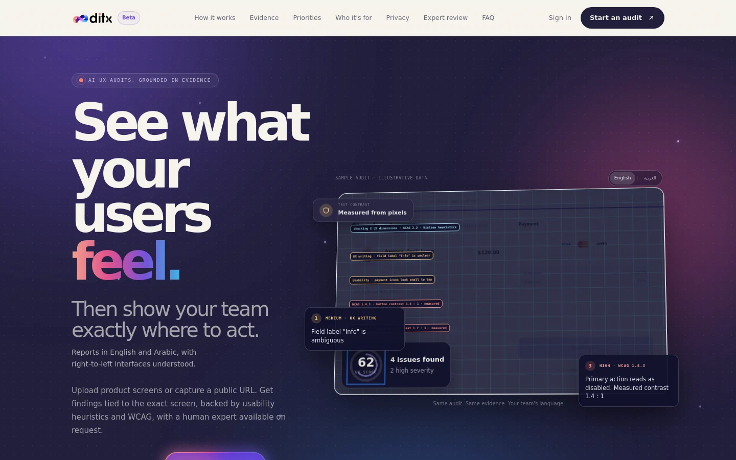
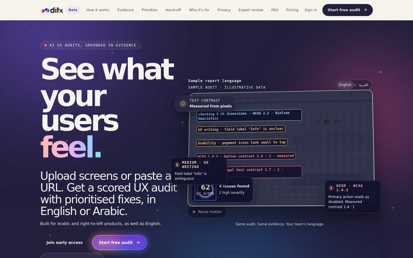
01 / The diagnosis
The first screen asked visitors to work too hard to understand what to do, why to trust us, and where to find the details.
What we changed02 / The response
We addressed the clearest friction first. The score moved too, but the changes below are the measured outcomes—not a claim that conversion improved.
One clear “Start free audit” button everywhere, with “Free audit · No card needed · Results in 2–5 minutes” beneath it.
Pricing added to the main and mobile navigation.
Text below WCAG 4.5:1 outside the demo went from about 45 elements to 0. Minimum text size: 12px.
Contrast increased from 1.08:1 to 15.85:1.
Mobile menu button contrast increased from 1.9:1 to 15.86:1.
Pinch-zoom re-enabled.
A shorter hero; limitations moved to the FAQ.
Founder story and expert-led reviews added.
03 / Not yet verified
An honest audit includes the work it cannot settle from screenshots alone.
We are collecting real feedback from our first testers rather than inventing it.
Still to review in context with real visitors.
Marked “Needs testing”—screenshots cannot prove them.
Method note
Same URL, same goal, same five automatic captures (desktop and mobile). Scores are AI-assessed and can vary slightly between rounds.
Private by default. We capture one screenshot of the public page you enter and delete it after 7 days unless you create an account.
Evidence, then action
Run the same audit on your product and get a clear place to start.
Free audit · No card needed · Results in 2–5 minutes